CSS
Layout
- when building responsive layouts, default to the smallest (usually mobile) layout, and use media queries to adjust the layout for larger screens
Viewports
- layout viewport: the size of the rendered area when fully zoomed out, doesn't change as long as the screen size doesn't change
- based on layout viewport:
window.innerWidthandinnerHeight(in Chrome and Firefox)document.documentElement.clientWidthandclientHeight- [[#Viewport units]]
- Media queries
position: fixed<meta name="viewport">tags- by default, mobile browsers use a fake layout viewport ~980px wide to avoid squishing pages that aren't mobile-optimized
<meta name="viewport" width=device-width>sets the layout viewport to the actual device width
- based on layout viewport:
- visual viewport: the size of the actual visible area, smaller than the layout viewport if pinch zoomed
- based on visual viewport:
window.innerWidthandinnerHeight(in Safari)event.clientXandclientYwindow.visualViewport
- based on visual viewport:
window.pageXOffsetandpageYOffsetgive the offset of the visual viewport relative to the layout viewport
rem vs em vs px
- use
remfor values that should scale with the user's default font size (different from page zoom)- use
eminstead if the values are highly dependent on the current element's font size - in most browsers, the default font size is 16px if not modified by the user
- use
- examples:
- horizontal padding should usually use
px, since you don't want to shrink the line width just because the text is larger - vertical margins between paragraphs should usually use
em, since they should adapt to the paragraph's font size - borders and other decorative elements should use
px - media queries should usually use
rem- larger font sizes will increase the width of sidebars and other asides, which may make the main content area too narrow, so the mobile layout is often preferred- when used in media queries,
remalways refers to the default font size, even if you set a custom font size on the root element in CSS
- when used in media queries,
- horizontal padding should usually use
Responsive font sizing without media queries
font-size: clamp(2rem, 8vw, 4rem)
- scales the font size based on the viewport width, with minimum and maximum based on the root font size (values are examples and should be adjusted)
Selectors
Attribute selectors
| Operator | Meaning |
|---|---|
| ~= | a whitespace-separated list of words, one of which is exactly value |
| |= | can be exactly value or can begin with value immediately followed by a hyphen |
| ^= | starts with value |
| $= | ends with value |
| *= | contains value |
| [... i] | case insensitive |
:focus-visible
- Like
:focus, but only applies if the browser decides that focus should be shown visually (typically when using keyboard navigation)- Text fields apply
:focus-visibleeven when clicked into (in Chrome at least)
- Text fields apply
- Use
:focusas a fallback for browsers that don't support:focus-visible
button:focus-visible {
    outline: 2px solid white;
}

@supports not selector(:focus-visible) {
    button:focus {
        outline: 2px solid white;
    }
}
:user-valid and :user-invalid
- like
:validand:invalid, but only apply once the user has interacted with the form element- useful for marking invalid fields without marking the entire page as invalid on load
:has
- matches elements where any of the given selectors match relative to the current element
- Invalid selectors are ignored
- lets you target elements based on their children or subsequent elements
- takes the specificity of its most specific argument
:has cannot be nested inside another :has!
Do not use :has by itself, without another selector (ex. body:has), as this will cause it to be checked against every element on the page!
div:has(+ span) {
    /* matches divs immediately followed by a span */
}

div:has(> span) {
    /* matches divs containing a span */
}

div:has(+ span, > span) {
    /* matches either of the above cases */
}
:is
- matches any element that can be matched by any of the given selectors
- Invalid selectors are ignored
- takes the specificity of its most specific argument
:is(ol, ul) :is(ol, ul, :banana /* invalid selector is ignored */) {
    /* matches any nested list, ordered or unordered */
}
:where
- same as [[#:is]] but with specificity 0
:nth-child
Limiting with selectors
- lets you limit
:nth-child(and:nth-last-child) to only "look at" elements that match the given selector
<article>
  <h2>Example</h2>
  <img class="hero" src="https://picsum.photos/seed/apple/200/100" />
  <img class="inline" src="https://picsum.photos/seed/orange/200/100" />
  <p>
    Culpa irure anim occaecat ut voluptate duis aliquip consequat esse id id ad
    aute labore. Dolore ipsum ipsum cillum veniam. Nisi ex eiusmod sunt et
    veniam.
  </p>
  <img class="inline" src="https://picsum.photos/seed/banana/200/100" />
  <p>
    Minim magna ullamco nostrud laboris quis reprehenderit minim ex et. Ipsum
    velit Lorem sint ex in aliqua tempor non sunt enim consequat incididunt
    adipisicing do.
  </p>
</article>
- float inline images in alternating directions
article > img.inline {
  float: left;
}

/* this won't work, because both img.inline have odd indexes! */
article > img.inline:nth-child(even) {
	float: right;
}

/* but this will */
article > img:nth-child(even of .inline) {
  float: right;
}
- the
nth-childselector can't "see" selectors outside itself - in the example below, we want to select the 2nd
.importantitem after.anchor(should be item 8)
<ul>
  <li class="important">Item 1</li>
  <li>Item 2</li>
  <li class="anchor">Item 3</li>
  <li>Item 4</li>
  <li class="important">Item 5</li>
  <li>Item 6</li>
  <li>Item 7</li>
  <li class="important">Item 8</li>
  <li class="important">Item 9</li>
  <li>Item 10</li>
</ul>
/* ❌ this will select item 5 - it's after .anchor, and *separately* it's the second child with .important */
li.anchor ~ :nth-child(2 of .important) {
	color: lime;
}

/* ✅ This will select item 8, because it's the second child that is *after .anchor and has .important* */
:nth-child(2 of li.anchor ~ .important) {
	color: deepskyblue;
}
Properties
align- and justify-
- grid:
alignmoves along the block axisjustifymoves along the inline axis-contentmoves the grid areas within their container (if they don't take up the whole container)-itemsmoves grid items inside their grid area
- flexbox:
justify-contentmoves children along the main axis (corresponding to theflex-direction)- by default this matches grid, as the default
flex-directionisrow
- by default this matches grid, as the default
align-itemsmoves children along the cross axisalign-contentmoves wrapping flex lines within their container, and has no effect on non-wrapping flex containers
- block:
- as of April 2024,
align-contentcan be used in block layout to align children along the block axis
- as of April 2024,
Shorthand (place-)
- shorthand for
align-{property} justify-{property}
Center elements within a container
.container {
    display: grid;
    place-content: center;
}
animation
Shorthand
| Property | Default |
|---|---|
| duration | 0s |
| timing-function | ease |
| delay | 0s |
| iteration-count | 1 |
| direction | normal |
| fill-mode | none |
| play-state | running |
| name | none |
animation: 3s ease-in 1s infinite reverse both running slidein;
aspect-ratio
- Keeps the element at the specified aspect ratio (
width / height)
aspect-ratio: 16 / 9;
backdrop-filter
Nested backdrop filters
backdrop-filter not working for nested elements in Chrome
I have a div.outer and inside a div.inner, both with position: absolute; and backdrop-filter: blur(8px);. https://jsbin.com/nihakiqocu/1/edit?html,css,output Safari (left) gives the desired resul...
https://stackoverflow.com/a/76207141
Setting any of these values on an element turns it into a backdrop root:
filterbackdrop-filtermix-blend-modeopacity< 1maskor any mask sub-propertieswill-changespecifying any of the above values
Child elements can't "see through" a backdrop root, so backdrop-filter on children won't work as expected.
To fix this, move the backdrop-filter that's on the outer element to a pseudo-element:
.blurred-bg::before {
    content: '';
    position: absolute;
    width: 100%;
    height: 100%;
    backdrop-filter: blur(30px);
    z-index: -1;
}
background
- if you have multiple backgrounds, earlier ones are drawn on top
Shorthand
- separate position and size (in that order) with a slash:
center/80%or50% 50% / 0% 0% - If only one
boxvalue is specified, it sets bothoriginandclip colorcan only be specified on the last layer
| Property | Default |
|---|---|
| image | none |
| position | 0% 0% |
| size | auto auto |
| origin | padding-box |
| clip | border-box |
| attachment | scroll |
| repeat | repeat |
| color | transparent |
background: repeat scroll 0% 0%/auto padding-box border-box none transparent;
box-decoration-break
In Safari, requires -webkit- prefix and only works on inline elements
- copy decorations like borders and backgrounds to each line of wrapping text
box-decoration-break: clone;
without box-decoration-break
with box-decoration-break
box-shadow
Shorthand
inset? | offset-x | offset-y | blur-radius | spread-radius | color
box-shadow: 3px 3px red, inset -1em 0 0.4em blue;
Limit shadows to one side using clip-path
box-shadow: 0 0 16px 0 black;
clip-path: inset(0 0 -16px 0);
break-before, break-inside, break-after
There are many values, but these are the most common ones that are widely supported as of June 2024
- decide whether page or column breaks are allowed before, after, or inside an element
avoid: don't allow page or column breaks- before and after only:
page: force a page break before/after
- inside only:
avoid-columnandavoid-page: don't allow breaks of that type inside
clip-path
inset
- Simple insets from each side, clockwise from top
clip-path: inset(5% 10% 15% 20%);
polygon
- Can have any number of points, values are
<x> <y>
/* equilateral triangle */
clip-path: polygon(50% 0, 0% 100%, 100% 100%);

/* trapezoid that narrows at the top */
clip-path: polygon(20% 0, 80% 0, 100% 100%, 0% 100%);
circle
radius at center
clip-path: circle(50% at 50% 50%);
ellipse
radiusX radiusY at center
clip-path: ellipse(25% 40% at 50% 50%);
color-scheme
- choose whether the element adapts to the system color scheme
normal(default): use the browser's default color schemelightordarkwill force the element to the specified color schemelight darkmeans the element should support light and dark modes, and prefer light modedark lightis the same, but will prefer dark mode
only lightoronly darkprevents the browser from overriding the color scheme
- use prefers-color-scheme as usual to style elements based on the color scheme, or use [[#light-dark]] as a shortcut for setting colors
- consider using [[#System color keywords]] to make the page match the system
- you can set
color-schemeon the page root if your page has its own theme picker - add a
color-schememeta tag to render the correct page background before the CSS loads
<meta name="color-scheme" content="dark-light">
contain
- isolate an element and its contents from the rest of the document
- useful for reducing layout recalculation
- values (multiple can be used, separated with spaces):
size: the element's size is unaffected by its contentsinline-size: same assizebut for the inline direction only (can't be combined withsize)layout: nothing outside the element affects the element's internal layout, and vice versa- for example,
position: fixedchildren won't escape the element, and margins won't collapse with the parent's margin
- for example,
style: counters and quotes are scoped to the element and its contentspaint: the element's contents will not be drawn outside its border-box- this means if the element is off screen, its children don't need to be rendered because they can't escape the element's box
strict: same assize layout paint stylecontent: same aslayout paint style
- use
contain: content(or better, [[#content-visibility]]: auto) for elements such as articles that are independent from the rest of the page
contain-intrinsic-size
- lets you set a placeholder size for elements affected by size containment (such as from [[#contain]] or [[#content-visibility]])
- values are width and height
- can also use
contain-intrinsic-height,contain-intrinsic-width,contain-intrinsic-block-size,contain-intrinsic-inline-size
- can also use
- the
autokeyword tells the browser to remember the last rendered size, and use that as the intrinsic size if available
/* will behave as 300x100 while in size containment */
contain-intrinsic-size: 300px 100px;

/* will behave as 300x100 in size containment until rendered, then remember its actual size */
contain-intrinsic-size: auto 300px 100px;
container, container-name, container-type
See [[#Marking containers]]
content-visibility
- controls whether the browser renders the element's content - doesn't affect the box of the element itself!
- this includes text nodes and pseudo-content
visible: the default (normal rendering)hidden: the element's contents aren't rendered (similar todisplay: none), and are hidden from the accessibility tree and Find featureauto: the contents are only rendered if the element is "relevant to the user" - in or near the viewport, focused, selected, or in the top layerautoelements get layout, style, and paint containment, and size containment if off-screen- the contents of
autoelements that aren't being rendered still appear in the accessibility tree and Find feature- styles aren't rendered for the contents, so they'll still appear in the accessibility tree even if they have
display: noneorvisibility: hidden- usearia-hidden="true"to hide them from accessibility
- styles aren't rendered for the contents, so they'll still appear in the accessibility tree even if they have
- use the
contentvisibilityautostatechangeevent to start and stop expensive JavaScript based on the visibility state
- example usage: on a blog page, wrap each article in
content-visibility: autoso only visible articles are rendered- use [[#contain-intrinsic-size]] to ensure the elements still take up the correct space
Improving rendering performance with CSS content-visibility
font-weight
| Value | Common weight name |
|---|---|
| 100 | Thin (Hairline) |
| 200 | Extra Light (Ultra Light) |
| 300 | Light |
| 400 | Normal (Regular) |
| 500 | Medium |
| 600 | Semi Bold (Demi Bold) |
| 700 | Bold |
| 800 | Extra Bold (Ultra Bold) |
| 900 | Black (Heavy) |
| 950 | Extra Black (Ultra Black) |
forced-color-adjust
- Use
noneto override an element's colors when in [[#forced-colors]] mode- respect the user's choices - only use this if the colors the browser applies aren't readable
.button {
    forced-color-adjust: none;
}
gap
- Sets spacing between tracks in flex or grid views
- Unlike margins,
gapdoesn't apply to the outer edges
- Unlike margins,
- First value is gap between rows, second is gap between columns
- If only one value is given, it applies to both
- There are also separate
row-gap/column-gapproperties
gap: 10px 5px;
hyphens
none: words are never brokenmanual(default): words are only broken at line break opportunities (-characters or­)auto: the browser uses its dictionary to break words automatically
inset
- Shorthand for
top right bottom left(same syntax asmarginorpadding)
inset: 1rem 2rem; /* top: 1rem; right: 2rem; bottom: 1rem; left: 2rem; */
inset-block, inset-inline
- Short for
inset-block-start inset-block-end(or inline)
inset-block: 50px 100px; /* 50px start, 100px end */
inset-inline: 20px; /* 20px start and end */
interpolate-size and calc-size()
As of November 2024, supported in Chromium only
interpolate-size: allow-keywordslets you transition or animate between a length or percentage, andautoor another intrinsic size- one of the values must be a length or percentage
- set this on the root to enable it for the entire page
calc-size(size, expression)behaves likecalc(), but allows you to include an intrinsic size in the calculation (given as the first argument, and referred to in the expression with thesizekeyword)- only one intrinsic size can be used per calculation
width: calc-size(min-content, size + 100px)
mask
- Requires
-webkit-prefix on Chromium browsers - Useful for changing the color of SVG icons - set the
background-coloras the color you want and use the SVG as themask-image
mask-image: url('image.svg');
mask-mode: alpha; /* or luminance */
mask-composite: add; /* or subtract, intersect, exclude - if you have multiple masks, this controls how each one is composited with the masks below it */

/* these accept the same values as their background- equivalents */
mask-size: auto;
mask-position: center;
mask-clip: border-box;
mask-repeat: repeat;
Fade using a gradient
- use a linear-gradient from white to transparent for
mask-image
.fade p {
    mask-image: linear-gradient(to bottom, white, transparent);
}
Reprehenderit est tempor minim id cupidatat mollit velit sit. Eu magna ex nisi aute. Quis id culpa in ex incididunt est aliquip anim consectetur ipsum Lorem. Aute ullamco Lorem laboris tempor fugiat duis ex reprehenderit tempor et. Occaecat velit laborum sint aliquip eiusmod cillum sint esse officia. Nostrud minim duis anim minim tempor consectetur sit proident laboris ea et eiusmod. Irure aliquip ex amet cillum anim anim irure est ex cillum qui culpa aute.
mix-blend-mode
- controls how an element blends with its background
- use
mix-blend-mode: differenceto reverse text color of a progress bar
overscroll-behavior
contain: prevents scroll chaining (when scrolling past the edge of the container starts to scroll outside the container)none: prevents scroll chaining, and also prevents the "bounce" effect and pull to refresh
outline-offset
- Adjusts the amount of space between an element's edge and its outline
- can be positive or negative
print-color-adjust
- control whether the browser is allowed to optimize elements for printing (ex. by removing backgrounds or changing colors)
economy(default): the browser can adjust the element's appearance for printexact: don't change the element's appearance- make sure to test that the element looks right when printed!
resize
- lets you add a resize handle to elements
- values:
horizontal,vertical,both,none(default) - doesn't work on inline elements, or if
overflowisvisible
text-shadow
Shorthand
offset-x | offset-y | blur-radius | color
text-shadow: 1px 1px 2px black, 0 0 1em blue, 0 0 0.2em blue;
text-wrap
As of November 2024 pretty is only supported in Chromium, stable only in Firefox and Safari
- controls how text is wrapped
wrapandnowrap: same as [[#white-space]]balance: wraps and tries to keep the line length equal- only works for blocks of text with 6 or less lines
pretty: wraps and favors better layout over speedstable: wraps, but when the user is editing content, lines before the line being edited will remain static and not re-wrap
wrap
Est dolor excepteur exercitation adipisicing. Aute occaecat cillum esse nulla do eiusmod. In et non mollit do incididunt nisi cupidatat duis. Excepteur eu excepteur dolore nisi occaecat eu enim deserunt.
pretty
Est dolor excepteur exercitation adipisicing. Aute occaecat cillum esse nulla do eiusmod. In et non mollit do incididunt nisi cupidatat duis. Excepteur eu excepteur dolore nisi occaecat eu enim deserunt.
balance
Est dolor excepteur exercitation adipisicing. Aute occaecat cillum esse nulla do eiusmod. In et non mollit do incididunt nisi cupidatat duis. Excepteur eu excepteur dolore nisi occaecat eu enim deserunt.
touch-action
pan-x pan-y: allow single-finger panning, but not pinch zoom or double-tap zoompinch-zoom: allow multi-finger panning and pinch zoom, but not single finger panningmanipulation: disable double-tap zoom, but allow pan and pinch-zoom- same as
pan-x pan-y pinch-zoom
- same as
none: disable all pan and zoom gestures
transition
Transition from height 0 to auto
- Place the element in a container with this styling
display: grid;
grid-template-rows: 0fr;
transition: grid-template-rows;
- To transition to auto height, change
grid-template-rowsto1fr
transition-behavior
- lets you transition properties that are discrete (things like
display: nonethat can't be interpolated)- discrete properties will swap from one state to another at 50%, with no smooth transition
- exceptions for
display: noneorcontent-visibility: hidden: the browser will make sure the content is displayed during the entire animation- in the below example, the card will remain visible until the fade out is finished
- exceptions for
- discrete properties will swap from one state to another at 50%, with no smooth transition
- can be used in the
transitionlonghand, but you should include a version without it first for browsers that don't support it
.card {
    transition-property: opacity, display;
    transition-duration: 0.25s;
    transition-behavior: allow-discrete;
}

.card.fade-out {
    opacity: 0;
    display: none;
}
user-select
- Lets you control how text selection in an element works, or disable it entirely
none: disable text selection within the bounds of this elementall: select all the text within this element on clickÏ
user-select: none should be used sparingly, and only for UI text that a user isn't likely to want to copy (like button labels).
user-select: none;
white-space
- hang means that the character may be placed outside the box and does not affect sizing
| New lines | Spaces and tabs | Text wrapping | End-of-line spaces | End-of-line other space separators | |
|---|---|---|---|---|---|
normal |
Collapse | Collapse | Wrap | Remove | Hang |
nowrap |
Collapse | Collapse | No wrap | Remove | Hang |
pre |
Preserve | Preserve | No wrap | Preserve | No wrap |
pre-wrap |
Preserve | Preserve | Wrap | Hang | Hang |
pre-line |
Preserve | Collapse | Wrap | Remove | Hang |
break-qspaces |
Preserve | Preserve | Wrap | Wrap | Wrap |
zoom
- enlarges an element and affects layout (unlike
transformorscale)- elements are enlarged from the start of the block direction and center of the inline direction (top center by default)
- can take numeric values or percentages: 1.1 = 110%
- in the example below, the square with
zoomaffects layout, so its container expands to fit it, while the square withscaledoesn't
Flexbox
Make flex children the same size
Use flex: 1 1 100% to make every flex child the same size, regardless of content.
Prevent flex and grid items from overflowing container
By default, flex and grid items have min-width: auto and min-height: auto, meaning they can't be smaller than their content.
If the items are overflowing their container, set min-width: 0 or min-height: 0, or any overflow value other than visible on them.
Grid
- Use
orderto rearrange grid items - Use [[#gap]] to create gutters between grid tracks
Grid container properties
grid-template-columns, grid-template-rows
- Defines the count and size of explicit grid tracks (rows or columns)
grid-template-columns: 50% 50%;
/* these are the same */
grid-template-rows: 20% 20% 20% 20% 20%;
grid-template-rows: repeat(5, 20%);
- Use
autofor automatic sizing, ornoneto remove the explicit grid
fr
- The
frunit represents one "part" of the available space - Unlike percentages,
frdivides up extra space - columns won't overflow, even if that means breaking the proportions given
grid-template-columns: 1fr 3fr;
grid-template-columns: 25% 75%;
fralso ignores [[#gap]], while percentages don't (since they're based on the total area of the grid container)
minmax
- Item size will be >= min and <= max
- use
minmax(0, 1fr)to keep all rows/columns the same size, and keep them from overflowing (see [[#Prevent flex and grid items from overflowing container]])
auto-fill
- Use the
auto-fillkeyword to create as many tracks as will fit in the container
grid-template-columns: repeat(auto-fill, 200px);
auto-fit
- Use
auto-fitwith [[#minmax]] to make the tracks expand to fit any leftover space
grid-template-columns: repeat(auto-fit, minmax(200px, 1fr));
Named lines
- You can name grid lines to make them easier to reference with [[#grid-row-start, grid-column-start, grid-row-end, grid-column-end]]
- You can give the same line multiple names separated by spaces
- If you name lines with
-startand-end, the browser will generate an implicit named area between them (in the below example,sidebarandarticle)- The opposite is true: if you create a grid area named
article, it will generate named lines in each direction calledarticle-startandarticle-end
- The opposite is true: if you create a grid area named
main {
    grid-template-columns:
        [sidebar-start] 200px
        [sidebar-end article-start] 1fr [article-end];
}

.sidebar {
    grid-column: sidebar-start / sidebar-end;
}

.article {
    grid-column: article-start / article-end;
}
article-start article-end
grid-template-areas
- Lets you name certain grid areas, to make it easier to assign elements to them using [[#grid-area]]
- Also lets you change the layout without having to change styles for all the child elements
- Each string is a row, and each space-separated token within the string is a column
- strings don't need to be on separate lines (ie. you could write
"a a a" "b c c" "b c c"), but putting them on separate lines makes them more readable
- strings don't need to be on separate lines (ie. you could write
- Areas must be rectangular (ex. you can't do
"a a b" "a b b") - [[#Named lines]] named with
-startand-endwill generate an implicit named area- Conversely, named areas will generate implicit named lines with
-startand-endappended
- Conversely, named areas will generate implicit named lines with
- Named areas created this way can't overlap, but you can create [[#Named lines]] with
-startand-endsuffixes to create overlapping named areas
.grid {
    display: grid;
    grid-template-areas:
        "a a a"
        "b c c"
        "b c c";
}
- Use one or more dots to leave an empty space
grid-template-areas:
    ". a a"
    "b c c"
    "b c c";
- use media queries to make area layouts responsive
grid-template
- Shorthand for [[#grid-template-columns, grid-template-rows]]
grid-template: repeat(auto-fill, 200px) / repeat(2, 1fr);
- Can also be a shorthand for [[#grid-template-areas]] and row/column sizes
- Row heights go after each row, column widths go at the end separated by a
/
- Row heights go after each row, column widths go at the end separated by a
grid-template:
    "a a a" 100px
    "b c c" 50px
    "b c c" 50px / repeat(3, 1fr);
grid-auto-flow
- Controls the direction (
roworcolumn) that implicit grid tracks are created in (default:row) - Add
denseto "fill in" holes earlier in the grid - this may cause items to display out of order
grid-auto-rows, grid-auto-columns
- By default, implicit rows/columns are sized to fit their content, this property lets you give them an explicit size
grid-auto-rows: 100px;
grid-auto-columns: minmax(100px, auto);
Grid item properties
grid-row-start, grid-column-start, grid-row-end, grid-column-end
- Set which grid lines (not tracks!) an element's starting or ending edges touch (1-indexed)
- An element with
start: 1andend: 4will span three cells
- Order doesn't matter when using integers:
start: 4, end: 1is the same asstart: 1, end: 4 - Negative values start counting from the end:
start: -2will align the starting edge of the element to the next-to-last grid line- You can mix positive and negative:
start: 1, end: -1will span the whole track
- You can mix positive and negative:
- Use the
spankeyword to declare how many cells an element takes up
/* this element will be 2 cells wide */
grid-column-start: 2;
grid-column-end: span 2;
- Can also use [[#Named lines]] (don't put the name in quotes)
- If the specified lines are outside the bounds of the [[#grid-template]], the browser will generate implicit grid tracks for the item
- You can use this and [[#grid-auto-flow]] to accomplish some layouts without defining a
grid-templateat all
- You can use this and [[#grid-auto-flow]] to accomplish some layouts without defining a
grid-row, grid-column
- Shorthand for the above:
start / end
grid-area
- Shorthand for
grid-row / grid-column, orgrid-row-start / grid-column-start / grid-row-end / grid-column-end - Can also specify a named area from [[#grid-template-areas]] (not in quotes)
position: absolute
- Grid items with
position: absolutewill take their grid area as their containing block if they have one, or the entire grid if they don't- Make sure the grid container has
position: relative
- Make sure the grid container has
- In the example below, the highlighted block has
grid-column: 2 / 3set
display: contents
- Use
display: contentsto group grid children together, while still laying them out as part of the grid
See also
Functions
min, max
- you can perform calculations inside these functions without needing
calc()
width: min(100vw - 3rem, 80ch)
clamp
clamp(min, ideal, max)
- the middle value will be used as long as it's between min and max
minandmaxshould use a different unit thanidealfor it to have an effect- can perform calculations without needing
calc() - in this example, the font size will adjust with the viewport width, but will never be smaller than
1remor larger than3rem
font-size: clamp(1rem, 4vw, 3rem)
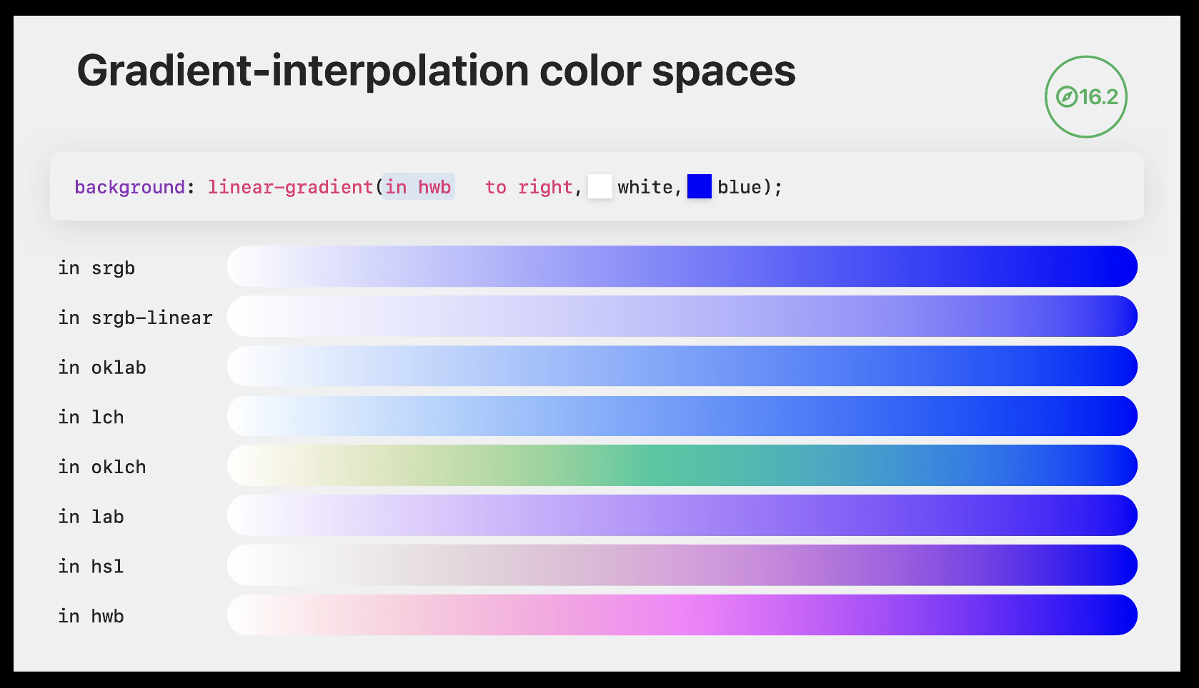
color-mix
color-mix(in oklab, red 25%, blue)
- There are lots of different color spaces,
oklabtends to give the most "natural-looking" result
Relative color syntax
- lets you create a color from another color without needing [[#color-mix]], and edit individual color components
- supported in all browsers as of July 2024
/* the input color can be in any format */*
color: rgb(from deepskyblue r g b);

/* can mix and match the individual components and numbers */
color: rgb(from deepskyblue g g 0);

/* or do math on them */
/* r g b channels are out of 255 */
color: rgb(from deepskyblue r calc(g * 2) b);

/* h is out of 255, s and l are out of 1 */
color: hsl(from deepskyblue h calc(s + .5) l);
Adjust transparency/alpha
- alpha is separated by a slash
/* reduce opacity by 50% */
color: rgb(from deepskyblue r g b / calc(alpha * 0.5))
/* reduce to 25% opacity */
color: hsl(from deepskyblue h s l / 0.25);
Lighten or darken a color
- OKLAB provides the most reliable results (see [[#color-mix]])
/* lightens the color by 25% */
color: oklab(from deepskyblue calc(l + 25) a b);

/* adjusts to 75% lightness regardless of the original value */
color: oklab(from deepskyblue 75% a b);
Saturate a color
color: hsl(from deeppink h calc(s + 0.5) l);
- use chroma instead of saturation to enter high dynamic range
color: oklch(from deeppink l calc(c + 0.5) h);
Create a color palette from a single color
Varied lightness:
:root {
  --base-color: deeppink;

  --color-0: oklch(from var(--base-color) calc(l + 20) c h); /* lightest */
  --color-1: oklch(from var(--base-color) calc(l + 10) c h);
  --color-2: var(--base-color);
  --color-3: oklch(from var(--base-color) calc(l - 10) c h);
  --color-4: oklch(from var(--base-color) calc(l - 20) c h); /* darkest */
}
Hue rotation:
:root {
  --base-color: blue;

  --primary:   var(--base-color);
  --secondary: oklch(from var(--base-color) l c calc(h - 45));
  --tertiary:  oklch(from var(--base-color) l c calc(h + 45));
}
Combine the two:
:root {
  --base-color: deeppink;

  --color-1: var(--base-color);
  --color-2: oklch(from var(--base-color) calc(l - 10) c calc(h - 10));
  --color-3: oklch(from var(--base-color) calc(l - 20) c calc(h - 20));
  --color-4: oklch(from var(--base-color) calc(l - 30) c calc(h - 30));
  --color-5: oklch(from var(--base-color) calc(l - 40) c calc(h - 40));
}
light-dark
- requires [[#color-scheme]] to be set
- lets you define light and dark colors (in that order) on one line
- only works for colors
:root {
    color-scheme: light dark;
}

p {
    color: light-dark(black, white);
}
At-rules
@container (container queries)
- allow you to apply styles to an element based on the size or computed properties of a specific ancestor (the container)
- container queries cannot be used to apply styles to the container itself!
.button {
    container-name: button;

    @container button style(--type: warning) {
        /* this doesn't work because we're trying to apply rules to the container that's being queried */
        background-color: red;

        & span {
            /* but this is fine */
            color: white;
        }
    }

    @container style(--type: warning) {
        /* this is valid if a parent of .button has --type: warning */
        background-color: red;
    }
}
Marking containers
- containers are marked with the
container-typeproperty- two values:
inline-sizeallows you to query the inline size only,sizeallows you to query both directions- use
sizesparingly for performance reasons
- use
- two values:
- you can name containers using
container-name, and reference them by name after@container- containers can have multiple (space-separated) names, and names can be shared between multiple elements/selectors
- shorthand:
container: name / type - containers have layout, style, and size or inline-size (depending on container type) containment applied
- this means a container's size won't be affected by its children, so containers need to have a set size of their own
Size queries
- supported in all major browsers as of February 2023
- style elements based on the size of a container's content-box
- padding isn't included, even if the element has
box-sizing: border-box
- padding isn't included, even if the element has
- supported query conditions:
width,height,block-size,inline-size,aspect-ratio,orientation- the first 4 require containment in that direction,
aspect-ratioandorientationrequirecontainer-type: size
- the first 4 require containment in that direction,
- container queries have their own length units that correspond to viewport units -
cqwforvw,cqminforvmin, etc- If not in a container, these units equal their corresponding viewport unit
Create a grid that collapses when its container is below a certain size:
<section>
    <div class="grid"></div>
</section>
section {
    container-type: inline-size;
}

.grid {
	grid-template-columns: repeat(auto-fit, minmax(0%, 1fr));
}

@container (max-width: 500px) {
	.grid {
		grid-template-columns: 1fr;
	}
}
-
by default, rules in container queries apply to the nearest ancestor container of the element receiving the rules
- this means that if there are multiple sets of rules in a container query, each set could have a different container
-
can use
and,or, andnotoperators to combine conditionsnotcan only be used once, and can't be combined withand/or
<article>
    <h2>Baked Ziti</h2>

    <section>
        <h3>Ingredients</h3>
        ...
    </section>

    <section>
        <h3>Directions</h3>
        ...
    </section>
</article>
article {
    /* can be targeted with the name `article` or `recipe` */
    container-name: article recipe;
    container-type: inline-size;
}

article section {
    /* shorthand */
    container: recipe-section / inline-size;
}

/* this will base header font size on the <article> width,
not the section width */
@container recipe (min-width: 500px) {
    h3 {
        font-size: 1.33em;
    }
}

/* same as above */
@container recipe (width >= 500px) {
    h3 {
        font-size: 1.33em;
    }
}

/* operator example */
@container recipe (width >= 500px) and (width < 1000px) {
    h3 {
        font-size: 1.33em;
    }
}
Style queries
As of November 2024, style queries for custom properties are not supported in Firefox, and no browsers support style queries for non-custom properties
- lets you query based on the computed values of properties on a container
- currently only works with custom properties, will eventually work with any property
- all elements are style containers - if a container name is not given, the container is the parent of the element receiving the styles
- for pseudo-elements (::before and ::after), the default container is the element the pseudo-element is attached to
- when querying a non-inherited property, be sure to explicitly specify a container name, since the parent's value may not be relevant
@container style(--alignment) {
    /* rules will apply if the value of --alignment differs from the initial value */
}

@container card style(--alignment: start) {
    /* rules will apply if the value of --alignment on the `card` container is `start` */
}

@container card style(--alignment: start) or style(--alignment: end) {
    /* operators work here too */
}
- not yet supported by any browsers: make elements that are usually italic normal if they're inside an italicized container
/* not supported by any browsers as of November 2024! */
@container style(font-style: italic) {
    em, i {
        font-style: normal;
    }
}
@import (don't use it)
Avoid using @import, as it makes the browser download CSS sequentially and slows down rendering. Instead, link the stylesheets separately in your HTML, or use a bundler to combine them into one stylesheet.
@layer (Cascade Layers)
- Layers that are declared later take higher priority
- You can declare layers at the same time as adding rules, but it's clearer to declare the layer names first and then add rules
- You can also specify a layer name when using
@import(though you should avoid using @import)
@layer reset, base, theme, utilities;

@import url(reset.css) layer(reset);

@layer base {
    button.filled {
        background-color: black;
        color: white;
    }
}

@layer theme {
    button {
        background-color: blue;
    }
    button.unthemed {
        background-color: revert-layer;
    }
}
- This button will have a blue background, because even though the rule in the base layer is more specific, the theme layer wins because it has a higher priority
<button class="filled">Click me!</button>
Rules outside of layers take priority over layered rules!
- Use the
revert-layerkeyword to "roll back" a value to the previous layer- Behaves like
revertif used outside a layer
- Behaves like
- This button will have a black background
<button class="filled unthemed">Click me!</button>
- When using
!important, the layer order is reversed: a!importantrule in base will override a!importantrule in theme- this means that
!importantrules in layers override unlayered!importantrules
- this means that
- Layers can have sub-layers, which can be referred to using dot notation
@layer framework {
    @layer base {
        ...
    }
    @layer theme {
        ...
    }
}

@layer framework.theme {
    ...
}
@media (media queries)
print and screen
- no parentheses needed
@media screen { }

@media print { }
prefers-color-scheme
@media (prefers-color-scheme: dark) { }

@media (prefers-color-scheme: light) { }
hover and any-hover
hovertests if the primary input method can hover,any-hovertests if any input method can- ex. on an iPad with a mouse connected,
hoveris false butany-hoveris true
- ex. on an iPad with a mouse connected,
@media (hover: hover) {
    /* the primary input device can hover */
}

@media (any-hover: none) {
    /* none of the input devices can hover */
}
prefers-reduced-motion
@media (prefers-reduced-motion: reduce) {
    /* disable transitions or replace with a simple fade */
}

@media (prefers-reduced-motion: no-preference) { }
prefers-reduced-transparency
Supported in Chromium only as of November 2024
@media (prefers-reduced-transparency: reduce) {
    /* remove transparency and backdrop-filters */
}

@media (prefers-reduced-transparency: no-preference) { }
forced-colors
- detect high contrast mode and other situations where the browser is overriding the page colors
- should be used for small tweaks only - respect the user's choices and don't try to override them
- in forced colors mode, the browser forcibly applies appropriate system colors to elements, and removes shadows and non-URL background-images (like gradients)
- use [[#System color keywords]] to adjust colors if necessary
- also see [[#forced-color-adjust]]
@media (forced-colors: active) { }

@media (forced-colors: none) { }
scripting
@media (scripting: none) {
  /* no JavaScript available */
}

@media (scripting: initial-only) {
  /* JavaScript only available during initial page load */
}

@media (scripting: enabled) {
  /* JavaScript fully available */
}
Boolean operators
and
@media (orientation: portrait) and (min-width: 300px) {
    /* portrait *and* at least 300px wide */
}
Multiple queries (or)
- use a comma to match one of several queries, just like with selectors
@media (orientation: landscape), (min-width: 300px) {
    /* landscape *or* at least 300px wide */
}
not
@media not (hover) { }
notapplies to an entire query, but only to one query in a comma-separated list
@media not screen and (color) { }
/* equivalent to */
@media not (screen and (color)) { }

@media not screen and (color), print and (color) { }
/* equivalent to */
@media (not (screen and (color))), print and (color) { }
Ranges
@media (width >= 300px) { }
@page
- lets you adjust the margins of printed pages
- use absolute units only!
- pseudo-classes:
:first,:left,:right,:blank(matches empty pages as a result of forced page breaks)
@page {
    margin: 1rem 0;
}

@page :first {
    margin-block-start: 0;
}
@property
- lets you define CSS custom properties with control over data type, inheritance, and initial value
- can be used to create animatable/transitionable custom properties
@property --property-name {
  syntax: "<color>";
  inherits: false;
  initial-value: #c0ffee;
}
-
Aallowed
syntaxvalues:<length><number><percentage><length-percentage>(same as<length> | <percentage>)<color><image><url><integer><angle><time><resolution><transform-function><transform-list><custom-ident>(see examples)
-
Examples:
syntax: "<color>";
syntax: "<length> | <percentage>";
syntax: "small | medium | large"; /* custom ident example */
syntax: "*"; /* any value */
@scope
Not supported in Firefox as of June 2024
- lets you limit a rule's reach based on a parent selector
@scope (.card) {
    img {
        /* only images inside .card elements get this border */
        border: 2px solid black;
    }
}
:scopematches the scope root&matches the selector used for the scope root - the difference is that&can be used multiple times
@scope (.card) {
    :scope {
        /* selects the .card element itself */
    }

    & & {
        /* selects a .card inside the matched .card */
    }
}
@scopecan accept a second argument to limit the reach- inheritance still passes through the scope bounds
@scope (.card) to (.card-content) {
    /* p elements inside .card-content won't be affected */
    p {
        font-weight: bold;
    }

    :scope {
        /* but they'll still inherit this text color if it's not overridden */
        color: gray;
    }
}

@scope (.card) to (:scope > .content) {
    /* elements inside .content won't be affected, but only if .content is a direct child of .card */
}

/* the limit can reference elements outside the scope */
@scope (.card) to (.sidebar :scope .content) {]
    /* .content only limits the scope if the card is inside .sidebar */
}
@scopedoesn't affect specificity:scopehas specificity of(0, 1, 0)(same as any pseudo-class)- if two
@scopeselectors have the same specificity, the one with a closer scope root wins- in the example below, the
pelement is white because.lightis closer than.dark
- in the example below, the
<div class="dark">
    <div class="light">
        <p>
    </div>
</div>
@scope (.light) {
    p {
        color: white;
    }
}

@scope (.dark) {
    p {
        color: white;
    }
}
@starting-style
As of November 2024, Firefox doesn't support animating from display: none
- lets you define starting values for an element, which can be used for transitions when the element is first drawn (either from being inserted into the DOM, or moved from
display: noneto visible)@starting-stylerules aren't applied when removing the element
- in this example,
background-colorwill transition from transparent to green when the element is inserted into the page
.alert {
  transition: background-color 2s;
  background-color: green;

  @starting-style {
    background-color: transparent;
  }
}
@supports
- lets you provide a property and value to test for browser support
@supports (color: rgb(from white r g b)) {
    /* this browser supports relative color syntax */
}
- can also test for selector support
@supports not (selector(:has(a, b))) {
    /* these rules will only apply to browsers that don't support :has() */
}
CSS Nesting
- Supported in all major browsers as of August 2023
- starting nested rules with a type (element) selector without using
&is currently inconsistent
- starting nested rules with a type (element) selector without using
.foo {
    .bar {
        /* equivalent to .foo .bar */
    }

    & .bar {
        /* same as above */
    }

    .bar & {
        /* .bar .foo */
    }

    &.bar {
        /* .foo.bar (note the lack of space) */
    }

    + .bar {
        /* .foo + .bar */
    }

    div {
        /* this will be .foo div, but browser support is inconsistent - use "& div" instead */
    }

    /* ⛔️ you can't concatenate strings */
    &__bar {
        /* this won't equal .foo__bar! */
    }

    /* but you can do this, as long as the type selector comes first (but note the caveat about browser support) */
    div& {
        /* div.foo */
    }

    /* you can use & multiple times */
    &:nth-child(1 of &) {
        /* matches the first .foo within its parent */
    }
}
Nested @rules
- you can nest media queries and other @rules, and leave out the selector if it's the same
.foo {
    color: black;

    @media (orientation: landscape) {
        /* by default matches the parent selector (.foo) */
        color: white;

        .bar {
            /* matches .foo .bar, but only in landscape */
        }

        @media (min-width > 1024px) {
            /* you can even nest multiple layers of @rules */
            /* equivalent to @media (orientation: landscape) and (min-width > 1024px) */
        }
    }
}
- cascade layers can be nested, which creates a new sub-layer joined with a dot
@layer base {
    @layer support {
        /* creates a layer called base.support */
    }
}
Animating dialogs and popovers
With [[#transition-behavior]]
dialog, [popover] {
    transition-property: opacity, display;
    transition-duration: 0.25s;

    /* when setting `display: none`, keeps the element visible until the end of the transition */
    transition-behavior: allow-discrete;

    @starting-style {
        /* triggers fade in when showing */
        opacity: 0;
    }
}

dialog:not([open]) {
        /* triggers fade out when hiding */
        opacity: 0;
    }
}

[popover]:not(:popover-open) {
        /* triggers fade out when hiding */
        opacity: 0;
    }
}
Without transition-behavior
- use an animation targeting the
[open]attribute - to animate closing (ex. for a fade out):
- when the close button is clicked, apply a class to the dialog that triggers an animation
- just reversing the animation that plays on open won't work, since it's still the same animation name
- set a one-time
animationendlistener that callsdialog.close()when the animation ends
- when the close button is clicked, apply a class to the dialog that triggers an animation
function closeModal() {
    dialogEl.addEventListener('animationend', () => {
        dialog.close()
        dialog.classList.remove('fade-out')
    }, { once: true })

    dialog.classList.add('fade-out')
}
Other
Styling elements with multiple states
- if an element can be in one of multiple exclusive states (for example, a dialog with normal, alert, or error states), use
data-attributes instead of classes, to avoid the possibility of applying multiple states and causing style conflicts- the default styles for when the data attribute isn't present should reflect the default state
Custom property resolution
- The browser first determines the cascaded value for an element, then "throws away" all other possible values, before checking if the cascaded value is valid
- this means if a custom property value is invalid, it won't fall back to a less specific value
<div class="card">
    <p>Lorem ipsum dolor sit amet</p>
</div>
html {
    color: red;
}

/* When calculating the `color` value for <p>, this gets thrown away because there is a more specific selector (.card p) */
p {
    color: blue;
}

.card {
    --color: #notacolor;
}

/* This gets selected as the cascaded value for `color`, but the actual value is invalid! But since the value on `p` was already thrown away, the browser falls back to the red color from `html`. */
.card p {
    color: var(--color);
}
- Custom property values are computed before inheritance happens
:root {
    --spacing: 0.5rem;
    --spacing-small: calc(var(--spacing) / 2); /* 0.25rem */
}

.element {
    --spacing: 1rem;
    /* --spacing-small is still 0.25rem because the value is
    calculated at the root level */
}
- when used in custom property values,
!importantonly applies when matching custom property values against each other, not against regular rules
div {
  --color: red !important;
  --color: blue;
  /* red wins even though blue was declared later */
  color: var(--color);
}
div {
  --color: red !important;
  color: var(--color);
  /* yellow wins because !important is stripped out after the value of var(--color) is resolved */
  color: yellow;
}
unset vs. revert
unsetuses the property's inherited value if it inherits, or its initial value if notrevertuses the element's default style (as set by the browser), unless the user has applied a custom style, in which case it uses that value- In practice, most methods of applying custom styles (such as Stylus) apply them to the
authorstyle origin, sorevertwill roll back to the browser's style anyway
- In practice, most methods of applying custom styles (such as Stylus) apply them to the
For example, the default value of the display property is inline, but browsers set <div> elements to display: block.
Setting display: unset on a <div> will apply display: inline, which probably isn't what you want. Setting display: revert instead will apply display: block.
opacity: 0 vs. visibility: hidden
- Elements with
opacity: 0are still:- clickable (will fire click events)
- focusable
- visible to screen readers
- Elements with
visibility: hidden(or content-visibility: hidden) don't do any of the above.
Intrinsic sizing keywords (min-content, fit-content, max-content)
min-content: soft-wrap content as much as possible (fit to the longest word/child)fit-content: fit to the container, but never smaller thanmin-contentor larger thanmax-contentmax-content: don't wrap content at all, even if it causes overflow
Viewport units
- based on the layout viewport (so they don't change when zooming)
svhandsvw: size when the toolbar is expandedlvhandlvw: size when the toolbar is shrunkendvhanddvw: change when the toolbar expands or shrinksvhandvw: depends on the browser, usually the same aslvhandlvwvminandvmax: the smaller or larger, respectively, ofvhandvw- also
svmin,lvmin, etc
- also
vbandvi: same asvhandvwbut using block & inline directions- also
svb,svi, etc
- also
Font-based length units (ex, cap, ch, lh)
ex: height of a lowercase letter in the current font, usually (not always) ~0.5emcap: height of a capital letter in the current font- useful for sizing icons inline with text
ch: inline size of the character0in the current fontic: inline size of the character 水 (size of full width ideographse of full width ideographs)lh: the computed line height- good for margins in sections of text
- root versions of all:
rlh, etc.
System color keywords
- use colors provided by the operating system
- browser support is inconsistent, so use [[#@supports]] to test and set fallback values appropriately
AccentColorandAccentColorTextaren't supported in Chromium as of January 2025
| Keyword | Example | Description |
|---|---|---|
AccentColor |
Background of accented user interface controls | |
AccentColorText |
Text of accented user interface controls | |
ActiveText |
Text of active links | |
ButtonBorder |
Base border color of controls | |
ButtonFace |
Background color of controls | |
ButtonText |
Text color of controls | |
Canvas |
Background of application content or documents | |
CanvasText |
Text color in application content or documents | |
Field |
Background of input fields | |
FieldText |
Text in input fields | |
GrayText |
Text color for disabled items (e.g. a disabled control) | |
Highlight |
Background of selected items | |
HighlightText |
Text color of selected items | |
LinkText |
Text of non-active, non-visited links | |
Mark |
Background of text that has been specially marked (such as by the HTML mark element) | |
MarkText |
Text that has been specially marked (such as by the HTML mark element) | |
VisitedText |
Text of visited links |
Negative transition/animation-delays
A negative transition-delay or animation-delay will start the transition/animation partway through. For example, transition-delay: -50ms will start the transition at the 50ms mark.
Make textareas resize to fit their content
Sync the textarea's contents to a data attribute on the wrapper:
<!-- vanilla example -->
<div class="grow-wrap" data-replicated-value="">
    <textarea onInput="this.parentNode.dataset.replicatedValue = this.value"></textarea>
</div>

<!-- Svelte example -->
<div class="grow-wrap" data-replicated-value={input}>
    <textarea bind:value={input}></textarea>
</div>
Style the wrapper the same as the textarea, overlay them using grid, and make the wrapper invisible
.grow-wrap {
    display: grid;
}

.grow-wrap textarea,
.grow-wrap::after {
    /* IMPORTANT: make sure the textarea and ::after element
       are styled exactly the same so they line up */
    white-space: pre-wrap;
    resize: none;
    overflow: hidden;
    /* position the textarea and ::after element in the same space */
    grid-area: 1 / 1 / 2 / 2;
}

.grow-wrap::after {
    content: attr(data-replicated-value) ' ';
    visibility: hidden;
    pointer-events: none;
}
Styling for print
- use @media print to restyle or hide elements when printing
- preview print rules in Chrome devtools -> Rendering -> Emulate CSS media type
- use [[#@page]] rules to adjust the page margins
- use [[#print-color-adjust]] to prevent the browser from changing the appearance of elements when printing
- use [[#break-before, break-inside, break-after]] to control where pages break
- use
orphansandwidowsto change the minimum number of lines that can be alone at the bottom/top of a page (both default to 2)